Forum:Proposal for a new title page splash image
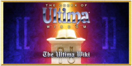
I've been meaning to have a stab at this for awhile but have only just gotten around to it now. I think it's about time we had some original artwork for our main page, and I hereby submit the following for consideration:
Inspired of course by the Codex scene in the U5 intro. I made the image the same size as the current one for ease of comparison, but the original is twice the size so any adjustments aren't a problem.
Happy to hear any feedback and/or suggestions! --Terilem 16:49, 12 April 2011 (PDT)
- Looks good! To be honest, the entire Codex could use a new skin, or at least, a skin. The current look isn't bad, but it's pretty minimalistic and plain. I don't want too many bells and whistles, but a simple skin that adds a little more color would be nice. Dungy 18:23, 12 April 2011 (PDT)
- Digging it, just make it BIGGER! And yes, must agree with Dungy -- the wiki could use some color, besides the green color of the templates we use (which is, like, yucky). --polygoncount (Polygon Dragon -==(UDIC)==-) 00:43, 13 April 2011 (PDT)
- I could certainly make it bigger, but I recalled the consensus being that anything larger than the current banner crowded the front page too much. I'll admit as an artist it was pretty heartbreaking to have to cut it down so small though, so I'd be more than happy to do it. :P
- Digging it, just make it BIGGER! And yes, must agree with Dungy -- the wiki could use some color, besides the green color of the templates we use (which is, like, yucky). --polygoncount (Polygon Dragon -==(UDIC)==-) 00:43, 13 April 2011 (PDT)
- And yeah I agree with the skin sentiments. I'm a fan of muted blues for something like Ultima. Even something along the lines of the current skin but as a steely blue (like what I used in the Ultima logo up there) would look nice I think. --Terilem 01:16, 13 April 2011 (PDT)
A new skin would be nice, as long as the article field itself still is black text on white ground. There are so many pictures with white backgrounds -made so that it seamlessly fuses with the white of the article page- that a color change in the article field would create some very ugly results. However, the backround of the outer frame and the sidebar could really use a facelift, maybe something like at the UO Guide, which looks really nice btw.--Tribun 03:07, 13 April 2011 (PDT)
- Btw., there is no problem for have the image bigger. We can resize it internally to the proper size without touching the source picture.--Tribun 03:09, 13 April 2011 (PDT)
- Re: Skins -- I assumed we were only talking about the sidebar, yeah. There's no reason to change the black text on white background. As for resizing the image, I'd prefer we decided on a size and then have the source image proportioned accordingly. Wiki-side resizing tends to look pretty horrid a lot of the time. --Terilem 03:37, 13 April 2011 (PDT)
Oh, in that case we should stick with the size the picture has now. Btw., it does look great, but the small white text needs to be a little more prominent, or it is swallowed by the yellow background. Otherwise good replacement for my admittedly quick replacement job.--Tribun 04:02, 13 April 2011 (PDT)
- Agreed. I took a different approach to resizing and now it stands out better. --Terilem 05:18, 13 April 2011 (PDT)
- Nice, I like it too. And I agree that some sort of skinning would be a welcome improvement.--Sega381 06:22, 13 April 2011 (PDT)
Agreed on most accounts here. I'm digging the new image, but I think the current size is fine. I don't want to see anything bigger, and I agree with Tribun that the whites need to be a little whiter so they don't blend in with the colourful background in that image. Also, agrees with Tribun that we want to keep the main page white background with black text. We'd have to change half the images on the wiki if we modified that. I'd just love to see some more colourful sidebars and the top bar. Muted blues work for me. Dungy 07:11, 13 April 2011 (PDT)
- About the white text, is that taking into the account the fix I've already applied? I know sometimes new versions of an image don't show up for me until I shift-refresh. --Terilem 08:00, 13 April 2011 (PDT)
- I think he means the old version, as the new one looks good.--Tribun 08:03, 13 April 2011 (PDT)
While we are at it, maybe someone can give our wiki-symbol (the one in the upper-left corner) also a little facelift? Not a new one, just making it nicer to look at (like for example make the Ankh really look like metal), since it's already quite old and looks a little dated by now.--Tribun 08:53, 13 April 2011 (PDT)
- What about a new logo that actually has the Codex, or the Codex symbol ingegrated? --polygoncount (Polygon Dragon -==(UDIC)==-) 16:14, 13 April 2011 (PDT)
Thank you for the feedback, everyone! The banner seems to have been given the stamp of approval, so I've updated the main page accordingly. :) --Terilem 04:14, 15 April 2011 (PDT)
- Looks good. Uhm, maybe you can try yourself at updating the logo (the one in the corner) as well? You seem to be really good at this.--Tribun 04:18, 15 April 2011 (PDT)
- Sure. I don't mind the way it looks at the moment, but I'll see what I can come up with for updating it. --Terilem 04:24, 15 April 2011 (PDT)
Logo[edit]
(Copied from Talk:Cannonballs)
Concerning the background design... I always liked the sidebar of hte UO Guide. If it could be something like that, it would already be a huge improvement. I also thing we should keep the logo -by now it has a long history- and should just improve it (something like making the Ankh look like made of real gold).--Tribun 05:14, 17 January 2012 (PST)
- What about something like this?
 (Still needs a bit of cleanup work) --Browncoat Jayson 09:18, 31 January 2012 (PST)
That already looks very promising, only a little more work needed to smoothen the endges of the ankh and make these purple... things (I forgot the name) look a bit more three-dimersional.--Tribun 09:41, 31 January 2012 (PST)
- I smoothed the sides of the ankh as much as I could without it becoming blurry, added a small drop shadow to the brackets, and made the blue slightly more transparent over the Black Sword. I'm not sure there is more I can do, but I do have a PDN file with all of the layers if someone has suggestions. You might need to refresh to see the new version. --Browncoat Jayson 12:15, 31 January 2012 (PST)
- Love it! What if the brackets had the same gold metallic look as the ankh, though?--polygoncount (Polygon Dragon -==(UDIC)==-) 13:55, 31 January 2012 (PST)
- Well, the ankh is from a UO wallpaper, and the blue brackets are from the new image on the main page (above; I wanted to tie them together somehow). I'll try to find a silver or gold material that I could use. --Browncoat Jayson 14:06, 31 January 2012 (PST)
- I've uploaded a new version with gold brackets. You can compare the two if you look at the File page for history. What do you think? --Browncoat Jayson 09:17, 1 February 2012 (PST)
The new version now looks really nice and I don't even miss the hoe.--Tribun 09:21, 1 February 2012 (PST)
- I would have included it if I could find a good drawing of one that meshes well with the Black Sword. It might get a little busy, however (I needed to look at the current logo a few times before I figured out what it was). I consider a Death Scythe or the ankh staff from the Ultima 4 cover too... --Browncoat Jayson 09:25, 1 February 2012 (PST)
- Definitely looks great, so is it final? --Iceblade 18:38, 10 February 2012 (EST)
- I say we use it, just need Fenyx to replace the image (as we can't do it).--Tribun 15:46, 10 February 2012 (PST)
- I'm happy with it. It looks a lot snazzier than the current design, although, I wouldn't mind some other Ultimaish item crossing with the hoe. Next step, nifty menus. Dungy 15:50, 10 February 2012 (PST)
- I say we use it, just need Fenyx to replace the image (as we can't do it).--Tribun 15:46, 10 February 2012 (PST)
I'll keep an eye out for anything that would look good in the background as well. Glad you like it. --Browncoat Jayson 18:23, 10 February 2012 (PST)
Hate to be the lone dissenter here, but I can't say I'm crazy about it. I feel the logo (and any artwork for the wiki) should be comprised of all original work instead of collages. I'll see if I can whip up what I have in mind for an alternative over this weekend. --Terilem 05:34, 11 February 2012 (PST)
- Okay, here's what I've done:

- The version on the right has some subtle distressing added to the Codex symbol, which I like the detail of but possibly at the expense of making it unnecessarily busy. I'm honestly not sure which one I prefer, so I'm showing both. I feel we should do away with the Black Sword and Hoe of Destruction altogether; it's a cute idea, but they're very U7-centric while the ankh and Codex symbol are more representative of the series as a whole. Thoughts? --Terilem 04:14, 19 February 2012 (PST)
- I REALLY like it. I'd have to agree with you about the blacksword/hoe of destruction. I would like to go with this.
- WOW. The one on the right is a keeper!--Tribun 06:31, 19 February 2012 (PST)
- The right ones got my vote. :) -- Fenyx4 13:05, 19 February 2012 (PST)
- Agree, that is a nice logo. Much better than my attempt. Good job! --Browncoat Jayson 13:29, 19 February 2012 (PST)
- Seems like pretty universal agreement. Fenyx4, when you have some time, could you switch up the logo? Also, now we just need to do something to make the top and sidebars a little spiffier, and we'll have a snazzy looking codex. At least better than Wikia. :P Dungy 13:37, 19 February 2012 (PST)
- We already have something better than Wikia. A 404 error is better than Wikia. ;)
- I'll change it right now. That doesn't take long at all. -- Fenyx4 14:40, 19 February 2012 (PST)
- Whoa, wasn't expecting it to happen that fast. You'll want to use the original without the black borders, otherwise the edges get cut off and I start having pedantic artist twitches:

- Thanks for the input, everyone! --Terilem 15:54, 19 February 2012 (PST)
- I was debating between asking for a original copy or waiting. As I feed off the suffering of artists I'm glad I waited. :)
- Original copy is up now. Might have to do a full refresh to see it (Ctrl-F5 on Firefox). In situ I think it looks even better! Thanks for making it. -- Fenyx4 16:01, 19 February 2012 (PST)
- Seems like pretty universal agreement. Fenyx4, when you have some time, could you switch up the logo? Also, now we just need to do something to make the top and sidebars a little spiffier, and we'll have a snazzy looking codex. At least better than Wikia. :P Dungy 13:37, 19 February 2012 (PST)
- Agree, that is a nice logo. Much better than my attempt. Good job! --Browncoat Jayson 13:29, 19 February 2012 (PST)
- The right ones got my vote. :) -- Fenyx4 13:05, 19 February 2012 (PST)
- WOW. The one on the right is a keeper!--Tribun 06:31, 19 February 2012 (PST)
- Wow. Nice surprising finding this logo after not coming around here for a while :).--Sega381 17:21, 9 March 2012 (PST)
- Yup, it's one of the many ways this wiki has gotten more awesome. I still remember what it was like when I first moved in back in late 2009. Wow, we've come a long ways. Dungy 17:32, 9 March 2012 (PST)
Menu Art[edit]
I think the next step should be a nicer looking side-menu, right? I imagine something like an open scroll would look good.--Tribun 17:45, 9 March 2012 (PST)
- That's what I think too. I'm not the man to do it, but that's how I envision it, something akin to what UOGuide does. Dungy 17:50, 9 March 2012 (PST)
- Would any of our more artistically talented members be able to work on such a thing? Dungy 16:16, 16 January 2013 (PST)
- I'm not sure the menu should be artified, at least not right away. I think a better and more logical first step would be to look at the site background first, and then evaluate what would work well for the menu. --Warder Dragon 23:21, 16 January 2013 (PST)
- Would any of our more artistically talented members be able to work on such a thing? Dungy 16:16, 16 January 2013 (PST)
