Talk:Cannonballs
Tribun, seriously - do you have to move ALL images to be on the right-hand side?? I started placing some on the left to break up the monotony. --polygoncount (Polygon Dragon -==(UDIC)==-) 13:13, 16 January 2012 (PST)
- Have you ever noticed how images to the left interfere with the bullets in lists? That's why I do it to prevent a formatting nightmare.--Tribun 13:17, 16 January 2012 (PST)
- That's odd, because I could see the bullets just fine on the previous revision. --polygoncount (Polygon Dragon -==(UDIC)==-) 15:22, 16 January 2012 (PST)
That problem is well known and entirely browser and details dependent (I for example only experienced it after going from XP to Win7), so I feel it is better to not tempt fate and avoid broken formatting.--Tribun 15:37, 16 January 2012 (PST)
- Ok, I guess. I still think it looks boring. --polygoncount (Polygon Dragon -==(UDIC)==-) 17:32, 16 January 2012 (PST)
- What I'd really love to do to spruce the wiki up some day is add a little more excitement to the top bar and sidebar. Some sort of colour and nifty new logo. Black text on white works great for the main area, though. Nothing like Wikia though, dear god wikia looks hideous. Dungy 17:54, 16 January 2012 (PST)
- Agreed. --polygoncount (Polygon Dragon -==(UDIC)==-) 18:19, 16 January 2012 (PST)
- Oh... yeah, I was supposed to start experimenting with some designs for that. Also, using Firefox in Windows 7 here and I don't experience problems with the bullets. --Terilem 20:05, 16 January 2012 (PST)
- What I'd really love to do to spruce the wiki up some day is add a little more excitement to the top bar and sidebar. Some sort of colour and nifty new logo. Black text on white works great for the main area, though. Nothing like Wikia though, dear god wikia looks hideous. Dungy 17:54, 16 January 2012 (PST)
- Ok, I guess. I still think it looks boring. --polygoncount (Polygon Dragon -==(UDIC)==-) 17:32, 16 January 2012 (PST)
It obviously is quite random, as it doesn't happen on my laptop (which I'm using right now).
Concerning the background design... I always liked the sidebar of hte UO Guide. If it could be something like that, it would already be a huge improvement. I also thing we should keep the logo -by now it has a long history- and should just improve it (something like making the Ankh look like made of real gold).--Tribun 05:14, 17 January 2012 (PST)
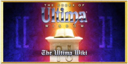
- What about something like this?
 (Still needs a bit of cleanup work) --Browncoat Jayson 09:18, 31 January 2012 (PST)
That already looks very promising, only a little more work needed to smoothen the endges of the ankh and make these purple... things (I forgot the name) look a bit more three-dimersional.--Tribun 09:41, 31 January 2012 (PST)
- I smoothed the sides of the ankh as much as I could without it becoming blurry, added a small drop shadow to the brackets, and made the blue slightly more transparent over the Black Sword. I'm not sure there is more I can do, but I do have a PDN file with all of the layers if someone has suggestions. You might need to refresh to see the new version. --Browncoat Jayson 12:15, 31 January 2012 (PST)
- Love it! What if the brackets had the same gold metallic look as the ankh, though?--polygoncount (Polygon Dragon -==(UDIC)==-) 13:55, 31 January 2012 (PST)
- Well, the ankh is from a UO wallpaper, and the blue brackets are from the new image on the main page (above; I wanted to tie them together somehow). I'll try to find a silver or gold material that I could use. --Browncoat Jayson 14:06, 31 January 2012 (PST)
The new version now looks really nice and I don't even miss the hoe.--Tribun 09:14, 1 February 2012 (PST)
- I uploaded the new file with gold. I also copied this discussion to Forum:Proposal for a new title page splash image, since this talk page is a really strange place to discuss this... --Browncoat Jayson 09:19, 1 February 2012 (PST)
